Twinnies
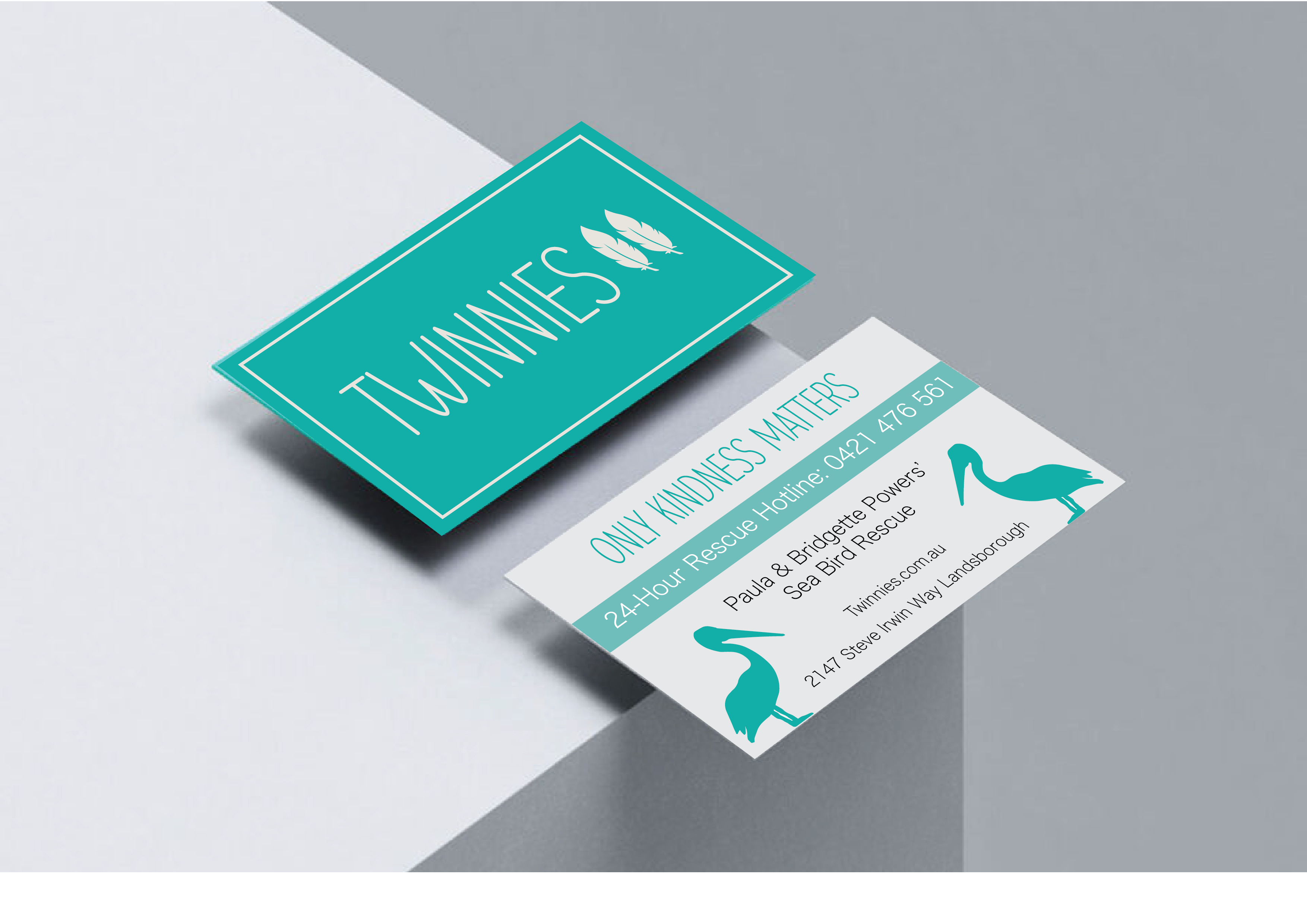
The aim for this rebrand was to increase the clarity of Twinnies’ branding to better reflect what the organization actually does. The wordmark ’Twinnies’ logo was too vague- while it portrayed their unique selling point of being twins, it did not allude to sea birds, rescuing or charity. I've updated the logo to a combination mark that features their name as well as a double pelican feather image that better reflects their purpose and practices as a pelican and seabird rescue centre. The logo is complemented by pelican and seabird silhouettes in their new print media as well as bird statues and other nautical designs in their interior styling to further solidify their identity as a seabird rescue. This new branding results in a more resolved visual identity that fosters trust and recognition and makes it easier for viewers to engage with promotional material about volunteering and more likely to visit the rescue centre, purchase apparel, donate and become a part of the Twinnies community.