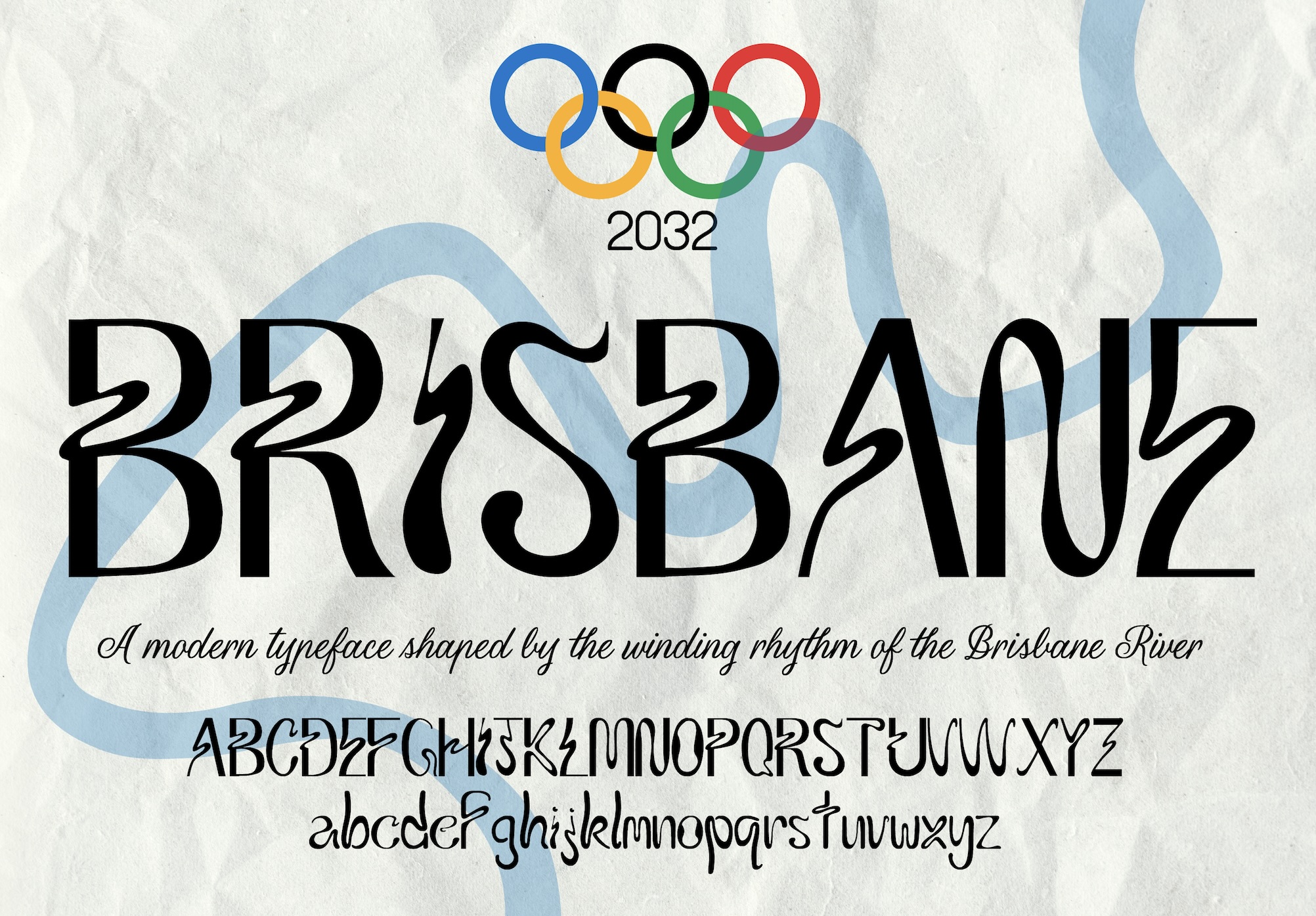
Brisbane Typeface
I designed this font to give Brisbane a unique visual identity for the upcoming 2032 Olympic Games. I wanted to communicate this city's dynamism, culture and connection to nature to a global audience in a way that feels authentic to locals. To do this, I took inspiration from the Brisbane river, a vibrant recreational hub and place of deep historical significance- a perfect symbol through which to explore Brisbane’s identity. The letterforms feature expressive flowing motifs that represent the bends and contours of the Brisbane River, particularly, the winding stretch between South Brisbane and New Farm. It's sharp, dynamic and embodies Brisbane's lively energy.